Spreadsheets vs. Maps
In an increasingly digital world, where we are injected with huge amounts of data coming from multiple sources, the way we organize information and present it becomes a decisive factor for decision making. Data is often structured in tables (from databases) and can be visualized in various ways, and depending on the information collected, there are more appropriate ways to represent it.
As a data analyst, you need a way to transform your data into something readable for everyone. As easy as it can be for data analysts, we must adapt our findings so other people can get the same insights as us or even more. Database software or spreadsheets are great for analytics, but not so great for data visualization.
Consider this example, you have a data spreadsheet for a country’s municipalities (data with a spatial component). You have a column with an ID and data for each municipality (residents, youngsters, adults, seniors, purchase power, number of cars, etc.): How fast can you get insights from your data? Sure, you have all your data, all the information you need to get insights from it, but how long it will take? Maybe you will need to do some charts to see how the residents are distributed in the age groups, or a pivot table to aggregate some data (residents by age). But how do you see spatial patterns?
In this case, software with a geographic component is key to visualizing spatial patterns. Seeing data in a map can explain the values in the data. With geographic software, you can unlock views and spatial relationships that you can't get with a spreadsheet.
However, not all geographic software is created equal. Some are very technical (like ArcGIS, QGIS, MapInfo), and you need heavy training to use them, others were made to simplify and broadcast the use of GIS to people/companies that don’t usually use GIS but could take advantage of using it. The GIS software made accessible for everyone usually is focused on a specific market or only has the functionalities needed in some businesses. Consequently, it is easier to learn. For example, Mapidea is a Location Analytics, a no-code solution built under the principles of simplicity and speed, empowering users to create geographical insights for better decisions. In that way, is built to be used by every department and not only GIS experts, only needing basic training to immediately start getting valuable insights.
Let’s do a practical example: Two datasets where the first one is a spreadsheet with information regarding the resident population for the Metropolitan Lisbon Area in 2019. There are 19 municipalities and information for all of them. The second dataset is a spreadsheet with dummy customers of a supermarket brand for the same area.
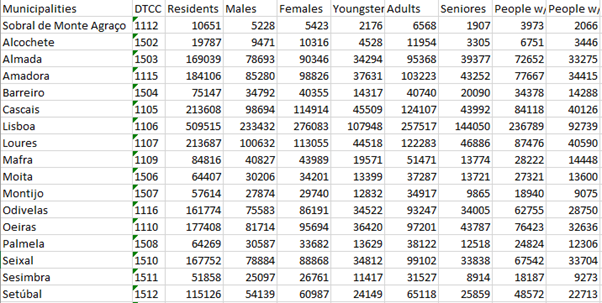
Resident population for the Metropolitan Lisbon Area, 2019

Dummy customers of a supermarket brand
To get started, we sum the residents' column in dataset 1, to see how many people are in that region and create a chart to visualize the age groups distribution. In dataset 2, we could do a pivot table to know how many customers are and their total expenses.
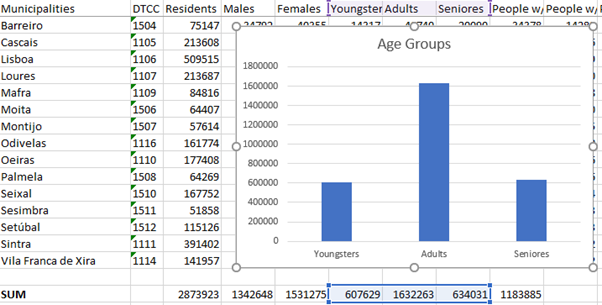
Age Group Distribution
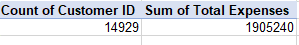
Customers and Expenses
In statistical terms, a spreadsheet gives us valuable information, but by spatial approach, the insights that we can get out of the data are barely inexistent. We don’t have any idea of how close the municipalities or the customers are to each other.
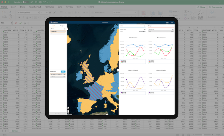
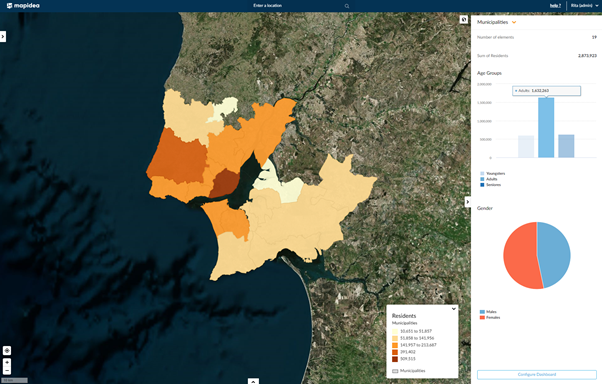
That’s where GIS can help. Let's see the same data but in a no-code GIS. In Mapidea we can simply drag&drop information and see it on a map. In Dataset 1, we have added that information to a layer with Portuguese municipalities, where we can see all the information in the table view. In dataset 2, we simply drag&drop, and it will instantly appear on the map.

Population (2019) and dummy Customers by Mapidea
Like in a spreadsheet, you can do charts in Mapidea and see the total of residents per age group. In dataset 2, we have crossed the information between the municipalities and the customers' dataset by their spatial relation (their location) and got insights, which is something that you cannot do on a spreadsheet.
In the example below, we made several maps to see where clients are concentrated. Easily, you can see the advantage of using a GIS when we count the number of customers in each municipality, sum the total expenses, and calculate the market share (combining the resident population and the number of clients in each municipality).
Number of Customers in each Municipality by Mapidea

Total Expenses by Mapidea
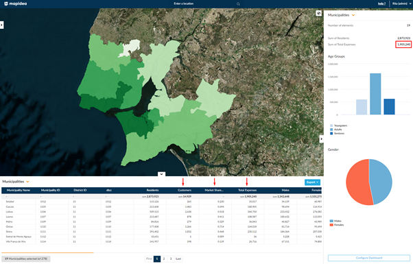
Market Share by Mapidea
Spatially speaking, Mapidea is great in showing results, and statistically, you can keep working on the data inside Mapidea. Just do your calculation in Mapidea and see the results instantly. If you need those calculations, simply export them to your favorite formats (Microsoft Excel, for example).
As you do not need to be an ace mathematician to work with a spreadsheet, you do not need to be a GIS expert to work with it. GIS takes an advantage over spreadsheets when it comes to spatial data, but they work well together, and everyone can gain from the insights gathered in both.
The same data have different outcomes when it comes to visualization. Frequently, you need to make rush decisions, so a tool that gives you insights within your data with a few clicks must be considered an essential tool for making business decisions.